Director of an independent event group, music label, and vintage store rooted in Melbourne subculture. Prioritised strong brand identity and user trust through a cohesive visual system, community involvement, and a modern webstore UX -differentiating it from peer stores that often relied on generic themes. Supported by real-world presence at events and pop-ups, the brand built lasting customer connections through curated content, product storytelling, and a clear, professional presentation.


Merchandising Strategy
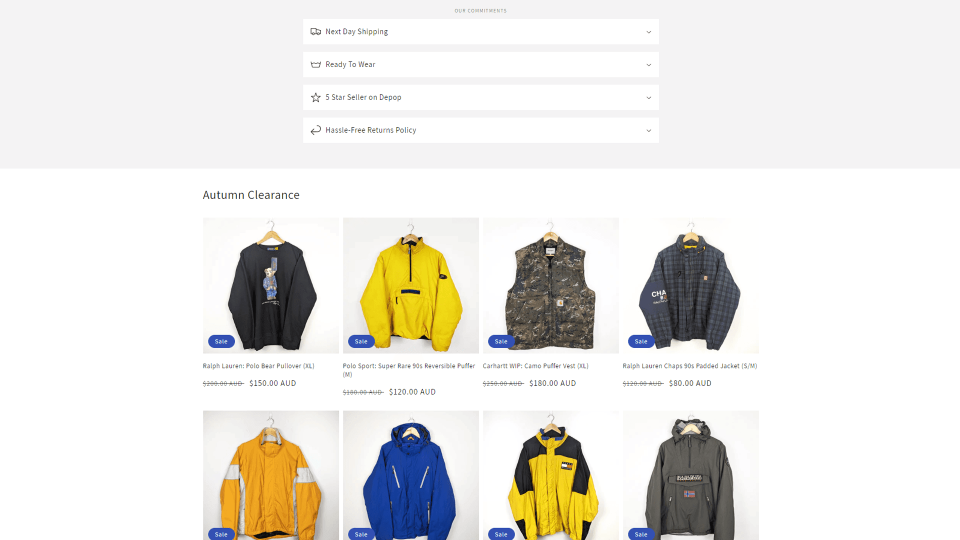
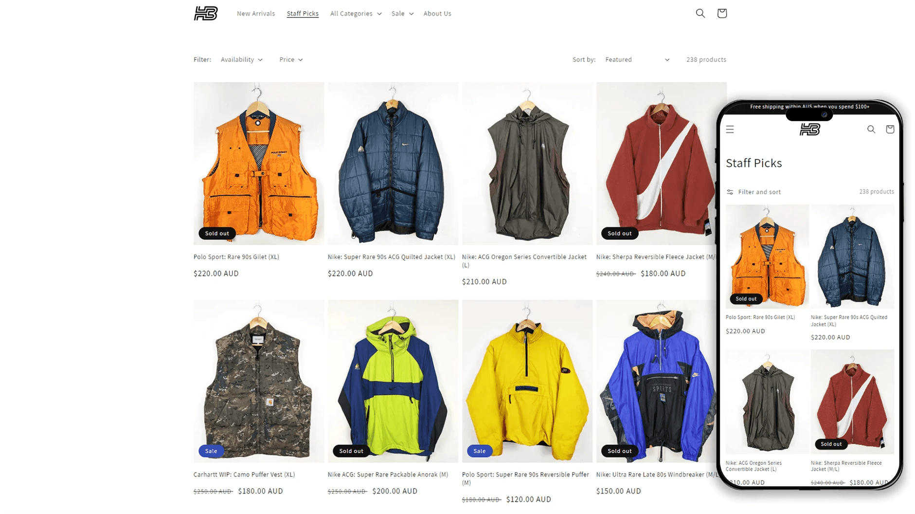
Intuitive, minimalist and product first layout, ideal for image-led decision making the target customer engages with, similar to Depop and eBay.
Sold-out items are left visible to demonstrate product demand, encouraging quicker purchases and increasing perceived value through scarcity.

User Experience
Top level category filters improve browsability of key pages. “Staff Picks” and Sale sections act as price driven funnels, giving different buyers a curated price point to shop from.
As products are all single units, sizing is included in all product titles to lower friction when browsing.
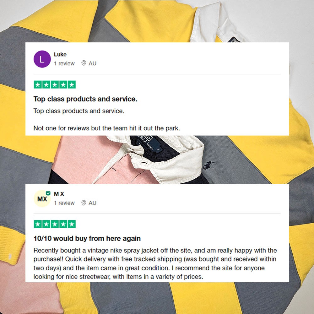
Social Proof
Automated email order follow ups to ensure customers are satisfied also include review link.
Reviews are highlighted on page (via social media) to build trust with new customers.


Before

After

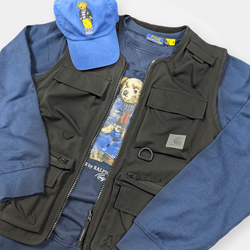
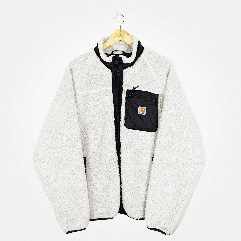
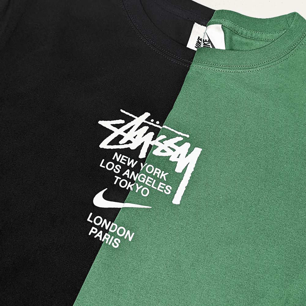
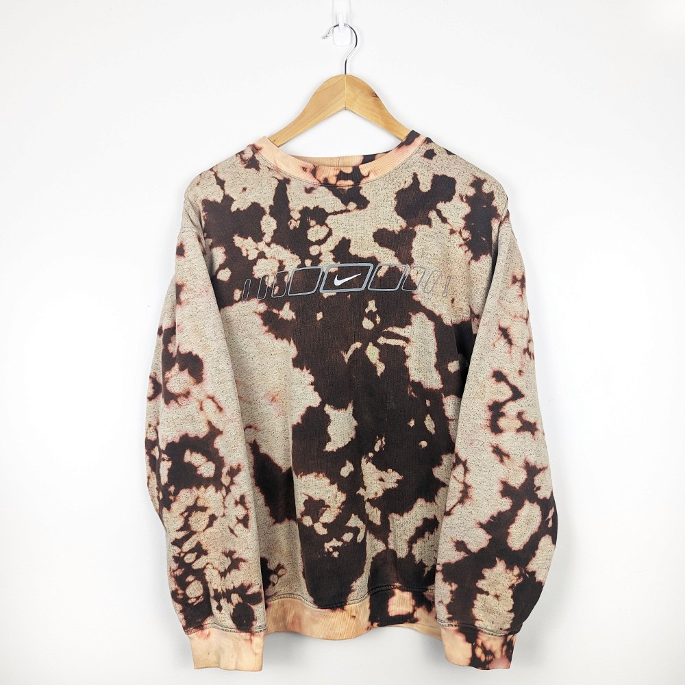
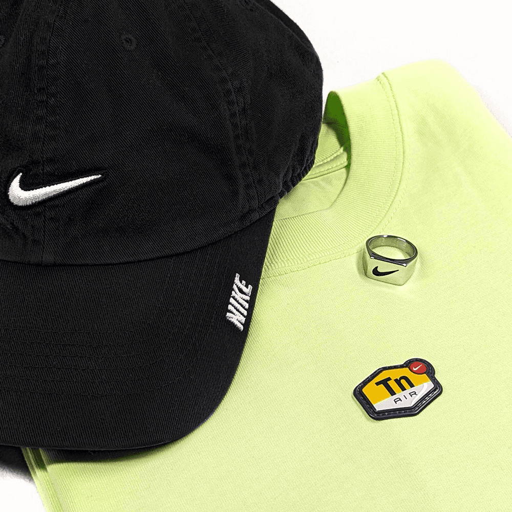
Photography Guidelines
Product photography strikes a balance between polished studio quality and the familiarity of marketplace listings. Backgrounds and lighting remain consistent while allowing for subtle variation to keep the presentation approachable.
Retouching is selectively applied—imperfections that misrepresent the item's true condition, such as storage creases, are removed, while genuine signs of wear are preserved to maintain accuracy and build buyer trust.


Workflows & New Skills
Running the brand solo meant directly managing every aspect—from product photography to content creation and logistics. This hands-on process rapidly built a practical skillset and taught me how to optimise workflows while staying aligned with the brand’s goals.
Connecting event-driven audiences and marketplace traffic to the core brand was essential. By using consistent visual branding and maintaining a clear identity, I built recognition across pop-ups, music events, and digital storefronts; bridging different spaces into one coherent experience.
To ensure cohesive communication across platforms, I developed a lightweight design system that guided visual content and brand tone. This allowed for fast content production without losing consistency, especially across web, social, and in-person activations.