Desktop App Design

Legacy App Redesign

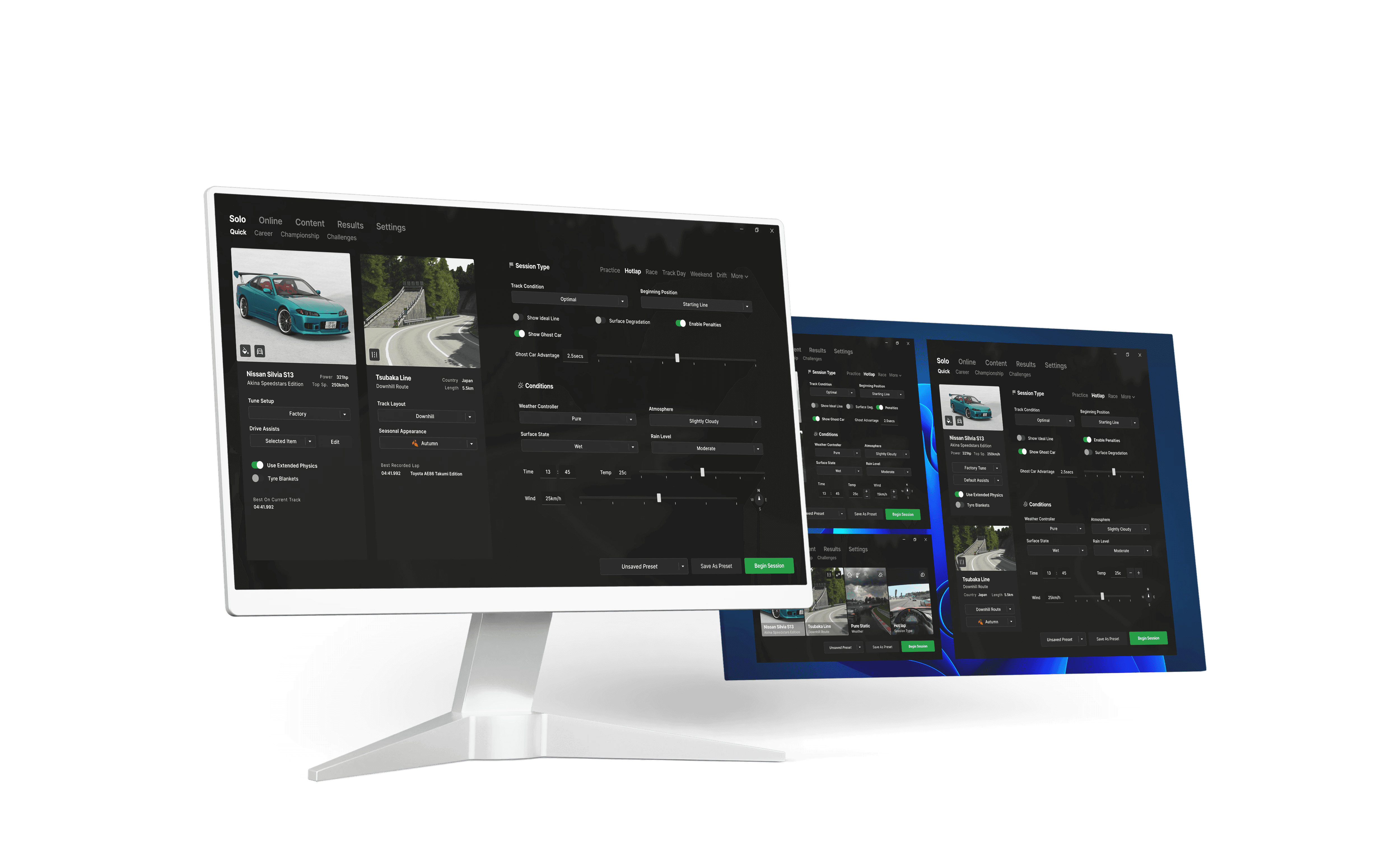
A conceptual redesign of the Assetto Corsa Content Manager desktop app, focused on improving responsiveness, interaction design, and information architecture. This project reimagines the interface to reduce friction and enhance usability, introducing an adaptive layout, reorganised settings, modern input patterns, and clear visual hierarchy for a faster, more intuitive user experience across all window sizes.

Role

Solo Designer

Desktop App Design

Legacy App Redesign

Redesigning with UX Principles

Redesigning with UX Principles

Redesigning with UX Principles

Redesigning with UX Principles

Identifying Core Issues

The original Content Manager interface is functional but dated, with poor responsiveness and inefficient user flows. This redesign applies universal UX principles to resolve common issues and deliver a cleaner, more usable experience.

The original Content Manager interface is functional but dated, with poor responsiveness and inefficient user flows.

This redesign applies universal UX principles to resolve common issues and deliver a cleaner, more usable experience.

The original Content Manager interface is functional but dated, with poor responsiveness and inefficient user flows.

This redesign applies universal UX principles to resolve common issues and deliver a cleaner, more usable experience.

The original Content Manager interface is functional but dated, with poor responsiveness and inefficient user flows.

This redesign applies universal UX principles to resolve common issues and deliver a cleaner, more usable experience.

Problems

Problems

Problems

Solutions

Solutions

Solutions

Lack of hierarchy complicates usage

Lack of hierarchy complicates usage

Lack of hierarchy complicates usage

Lack of hierarchy complicates usage

Reformat into groups with a logical order

Reformat into groups with a logical order

Reformat into groups with a logical order

Reformat into groups with a logical order

Poor responsiveness & use of space

responsiveness & use of space

Poor responsiveness & use of space

Poor responsiveness & use of space

Adaptive content that scales with window

Adaptive content that scales with window

Adaptive content that scales with window

Adaptive content that scales with window

Deeply nested essential settings

Deeply nested essential settings

Deeply nested essential settings

Deeply nested essential settings

Surface key options with clear descriptors

Surface key options with clear descriptors

Surface key options with clear descriptors

Surface key options with clear descriptors

Navigation & Inputs

The layout now guides the user logically from left to right, then downward, improving setup speed. Clearly defined steps and grouping of options improve the overall clarity of each setting without further explanations.

Additionally, inputs with unclear states or interactivity are replaced with modern elements. States are communicated via colour and outlines.

The layout now guides the user in a logical direction. Clearly defined steps and grouping of options improve the overall clarity of each setting without further explanations.

Additionally, inputs with unclear states or interactivity are replaced with modern elements.

The layout now guides the user in a logical direction. Clearly defined steps and grouping of options improve the overall clarity of each setting without further explanations.

Additionally, inputs with unclear states or interactivity are replaced with modern elements.

Adaptive UI Scaling

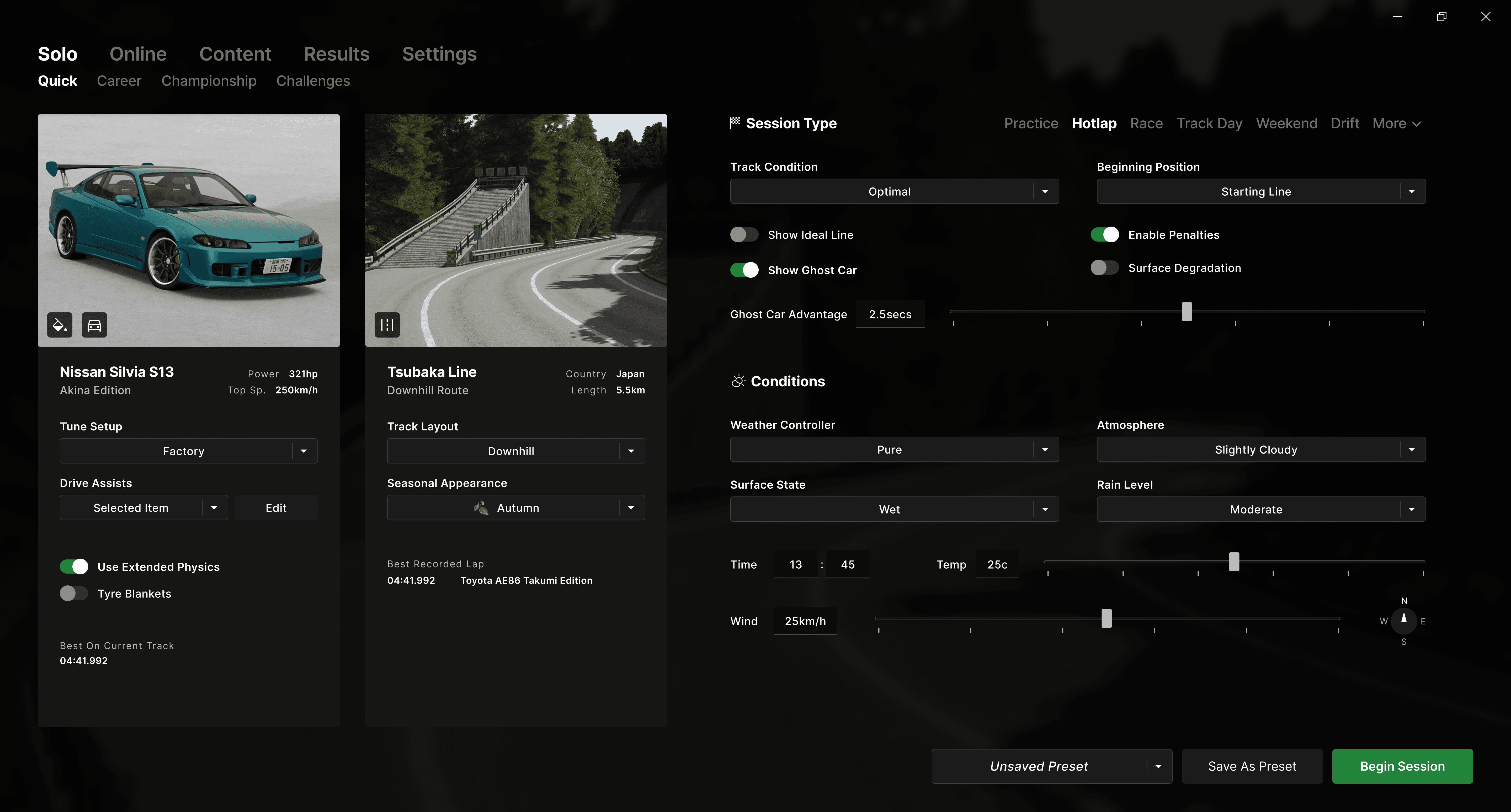
All essential settings are available no matter the window size by adapting user input types. Sliders change to buttons and text boxes, and secondary buttons attached to dropdowns are nested within the dropdown itself.

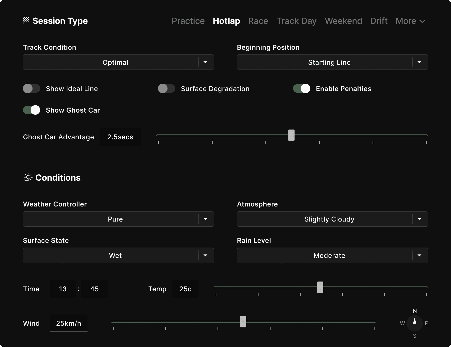
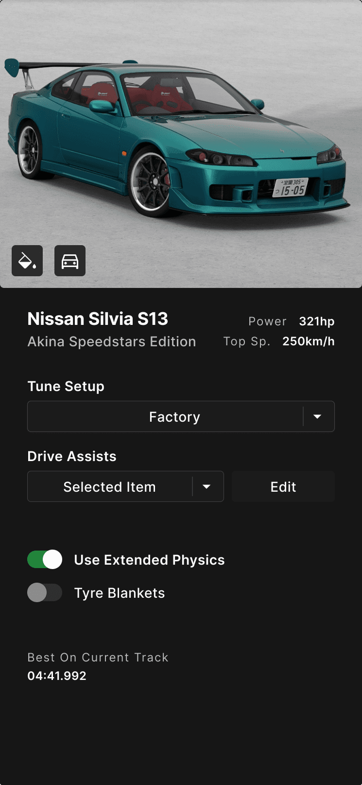
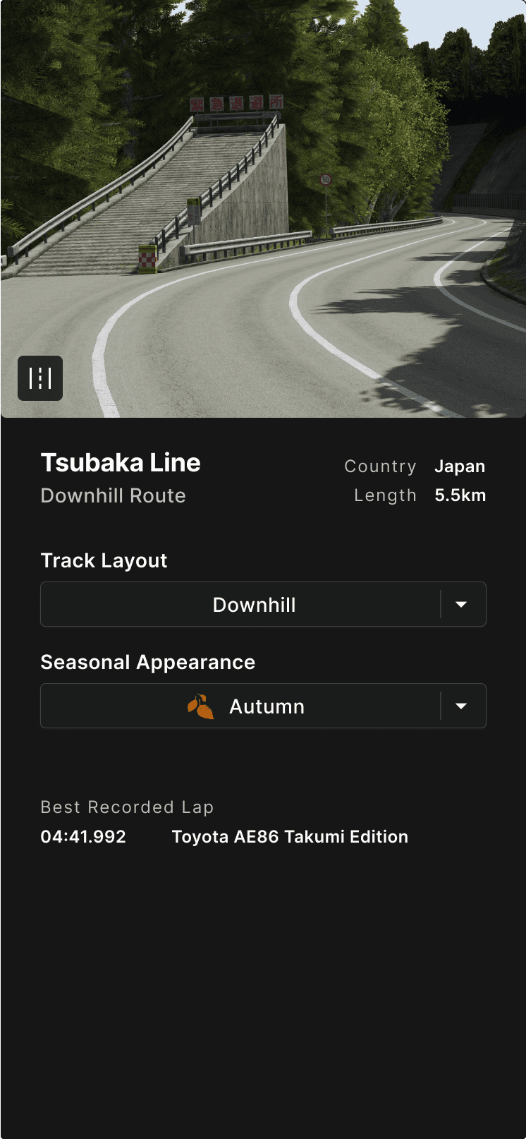
Surfaced Settings for faster setup

Tune, drive assists and track layout options are now immediately available within their respective panels.

To maximise space on smaller window sizes, option headings are nested within the dropdowns and non vital information (e.g. best recorded laps) are removed.

Breakpoints

Breakpoints

Breakpoints

Breakpoints

Full

Half

80%

60%

50%

Full

Half

80%

60%

50%

Full

Half

80%

60%

50%

Full

Half

80%

60%

50%

Reflections & Insights

Reflections & Insights

Reflections & Insights

Reflections & Insights

Modernising Without Disrupting

The redesign focused on refining the interface while respecting familiar workflows. Rather than reinventing the structure, I reorganised existing elements into a layout that improved clarity and usability, preserving what already worked for existing users.

Responsive Components with Consistent Identity

UI elements were designed with adaptive variants to suit different screen sizes while maintaining recognisability. For example, the temperature component retains its text box across all versions, ensuring consistency in both form and function.

Managing Information Density

With a UI reliant on dropdowns and advanced stats, establishing a clear hierarchy was essential. Spacing, alignment, and contextual visibility rules are used to reduce clutter and surface relevant information based on screen size and user priority.

Available for work, send me an email or view my CV

© 2025 Jordan Oliver

Contact Me

Based in Melboure, Australia

Available for work

© 2025 Jordan Oliver

Contact Me

Based in Melboure, Australia

Available for work

© 2025 Jordan Oliver

Contact Me

Based in Melboure, Australia