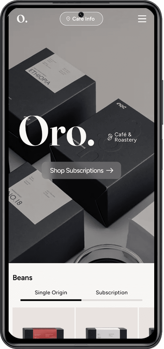
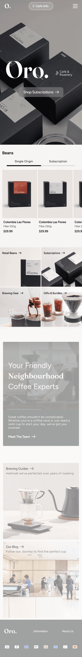
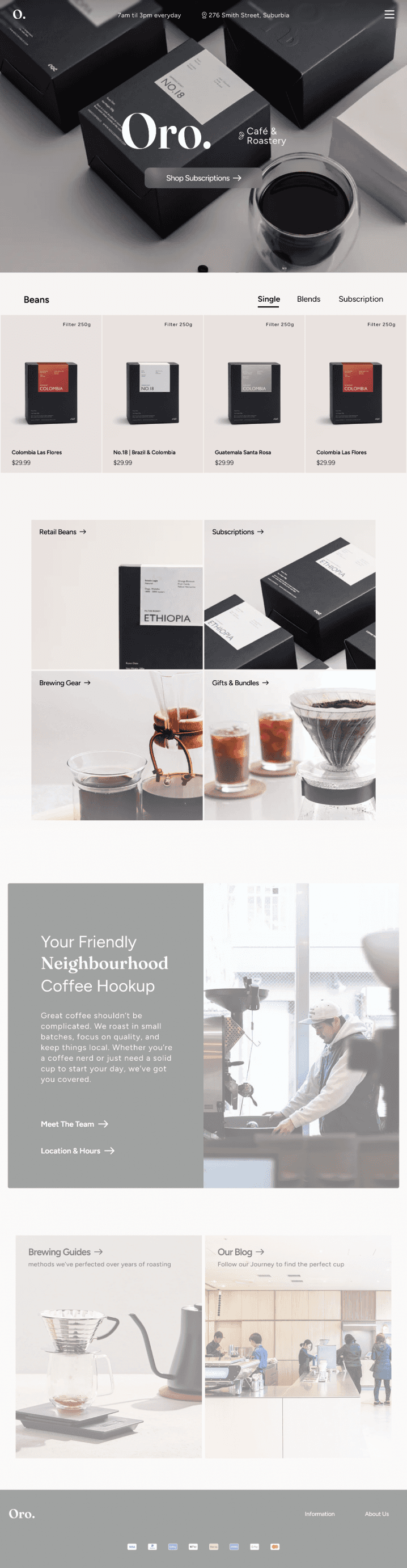
A conceptual eCommerce site for Oro, a specialty café and roastery, designed to reflect the in-store experience through a clean, mobile-friendly storefront. Strong visuals, minimal UI, and consistent design language create a conversion-focused interface that’s approachable, adaptable, and aligned with the café’s identity.


Creating consistent imagery


Modular Card Displays


Creating Movement with Micro Animations
Subtle scroll anchor animations implemented for fluidity without impacting overall readability or UI interactions.
Additionally, looping videos are used tactfully for pulling attention to key sections.


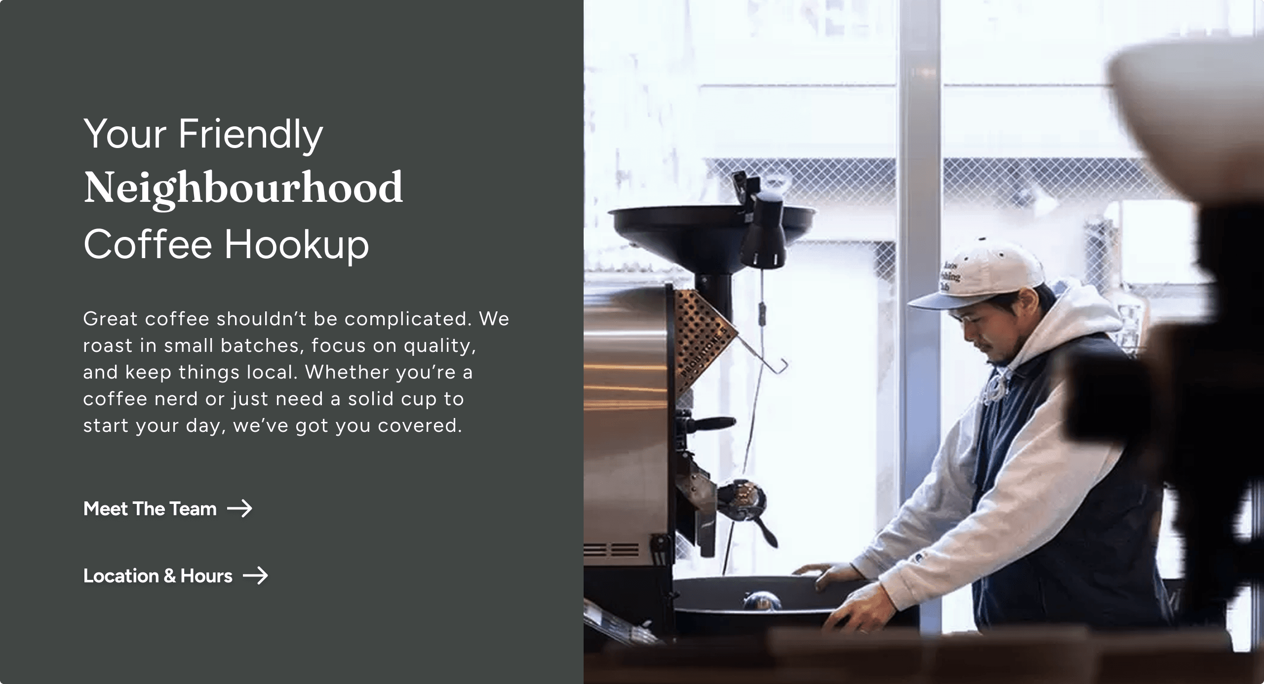


Balancing Brand, Conversion & Personality
Creating a clean, conversion-focused layout while maintaining brand warmth was a key challenge. Subtle copy choices, real-world imagery, and strategic placement of personable content reinforces authenticity without disrupting commercial intent.
Imagery as a Unifying Force
High-quality photos were central to the brand experience. Through consistent colour grading and lighting tweaks, I was able to unify mixed-source images into a cohesive visual system that elevated the site's polish and professionalism.
Adapting Components Across Viewports
Designing card components with image fills required careful attention to padding, focal points, and text hierarchy. I implemented multiple layout states to maintain visual clarity and functionality across screen sizes without sacrificing design integrity.