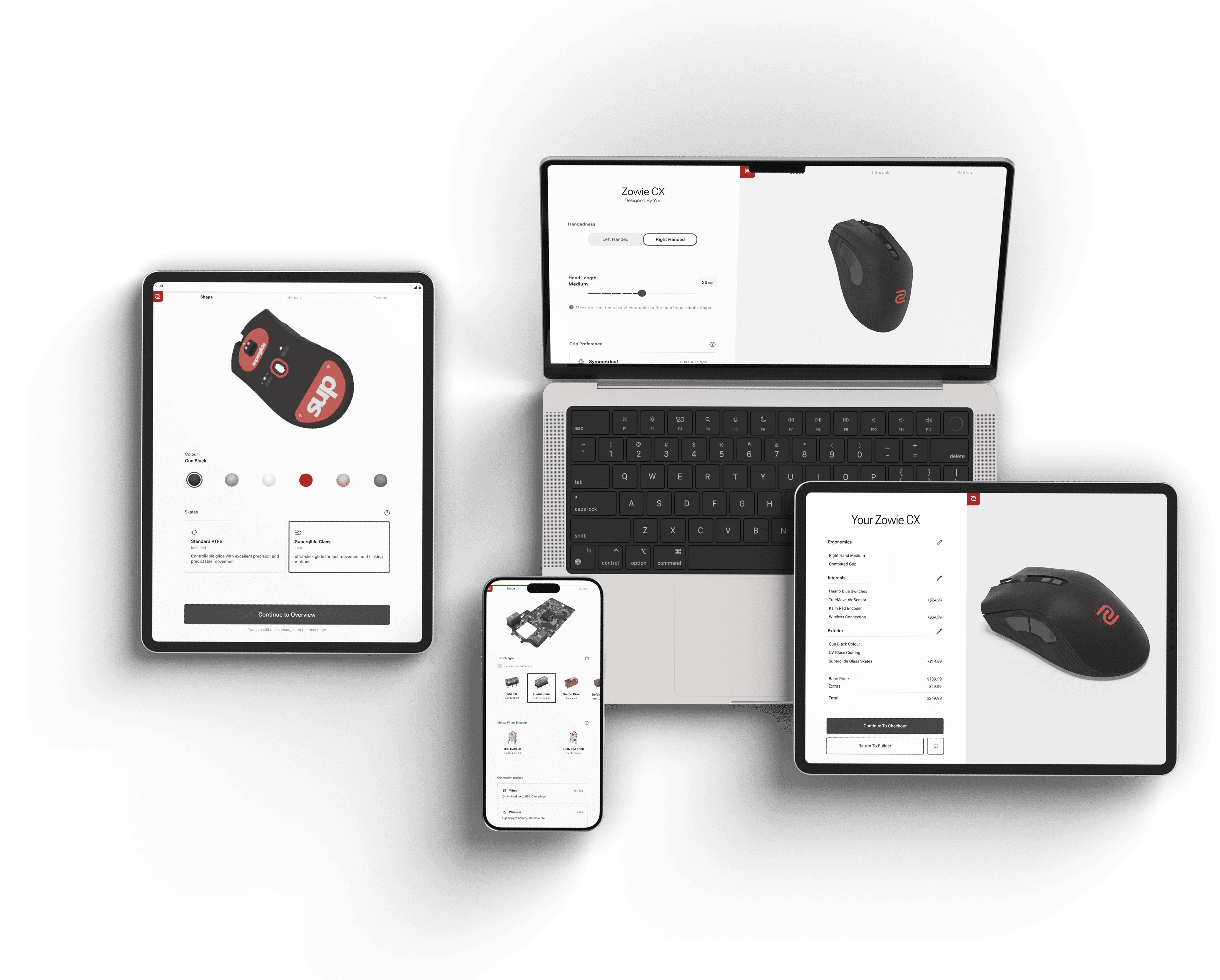
A conceptual solo project exploring how to simplify complex product choices into a linear, engaging flow. Inspired by automotive design tools, this mouse configurator fills a gap in the market by offering a customisation experience rarely seen for gaming mice.
Users are guided through ergonomic and internal component decisions with clear milestones, contextual overlays, and a responsive 3D model. The interface limits options to those with distinct functional differences to reduce decision fatigue and keep friction low.


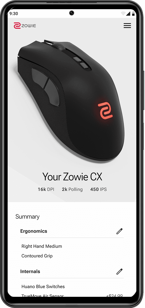
Modular 3D Mouse Model
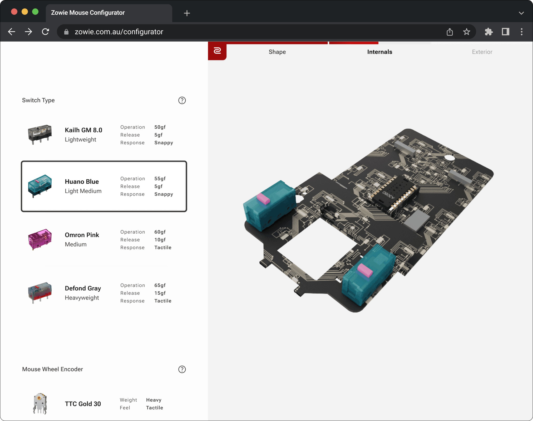
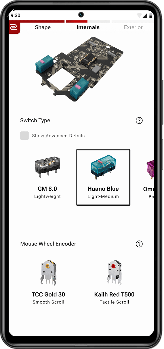
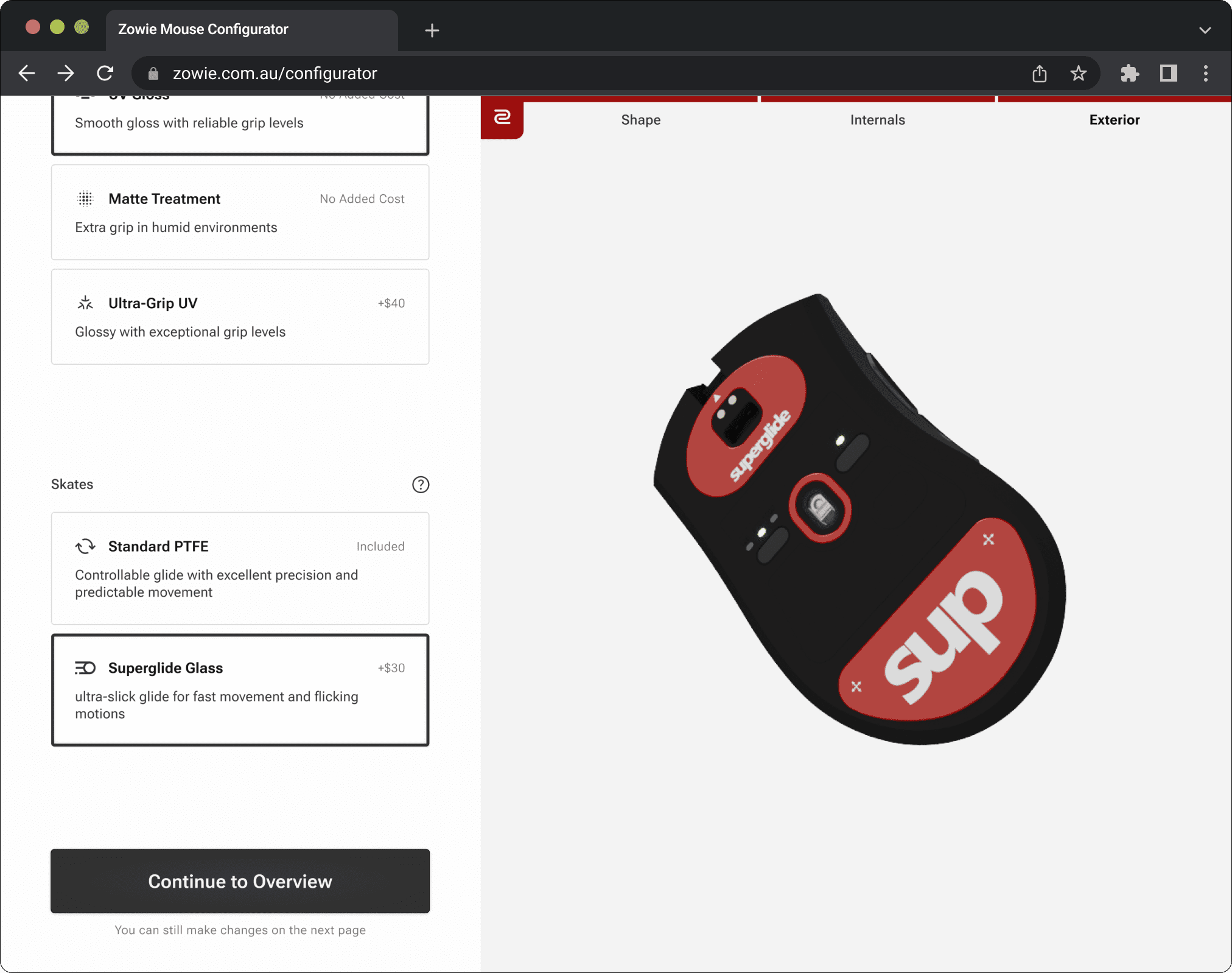
The custom Blender model consists of multiple modular components that swap dynamically on user input, giving immediate feedback on interactions.
Each step within the configurator triggers an animation to highlight the active area of customisation.
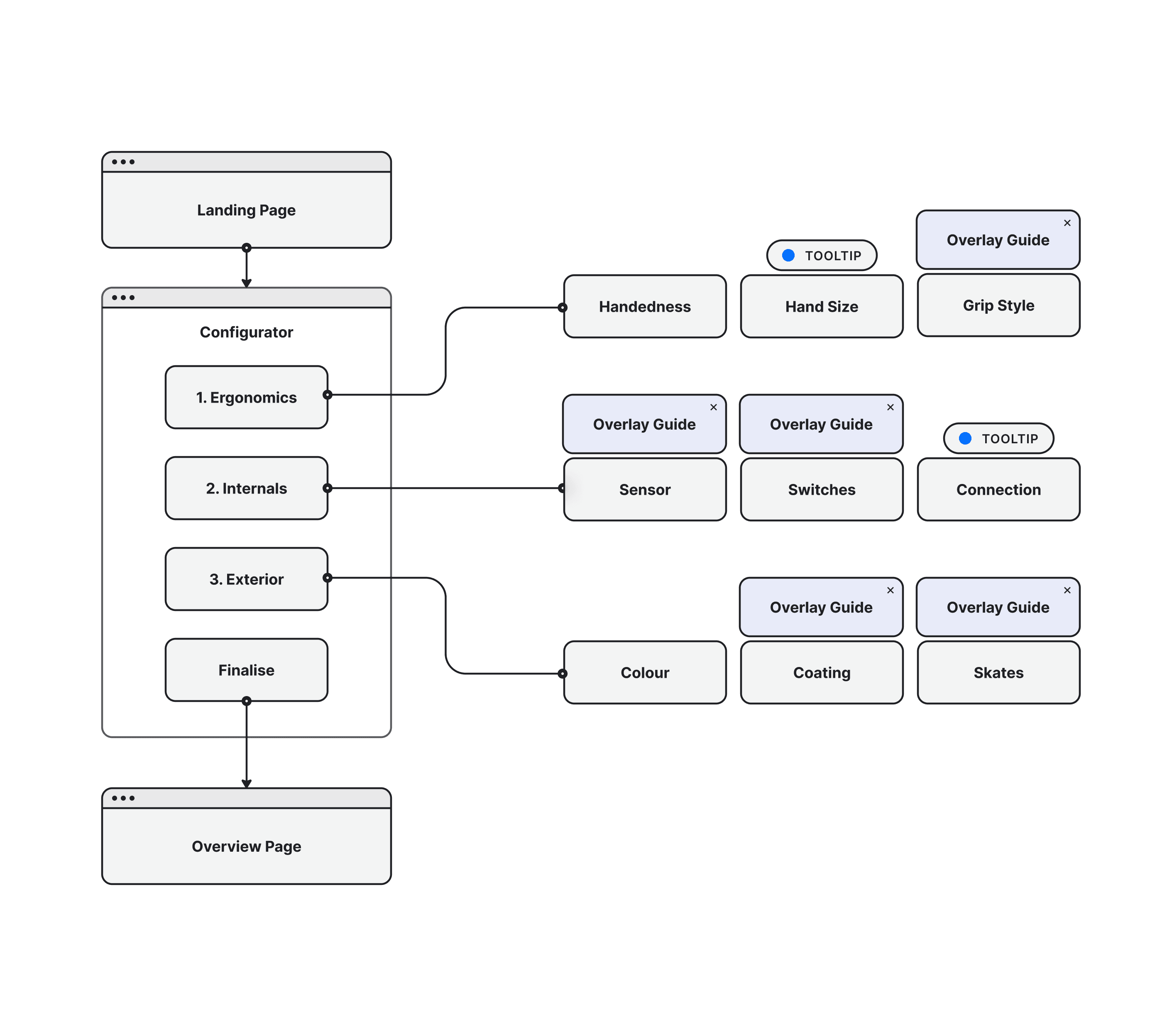
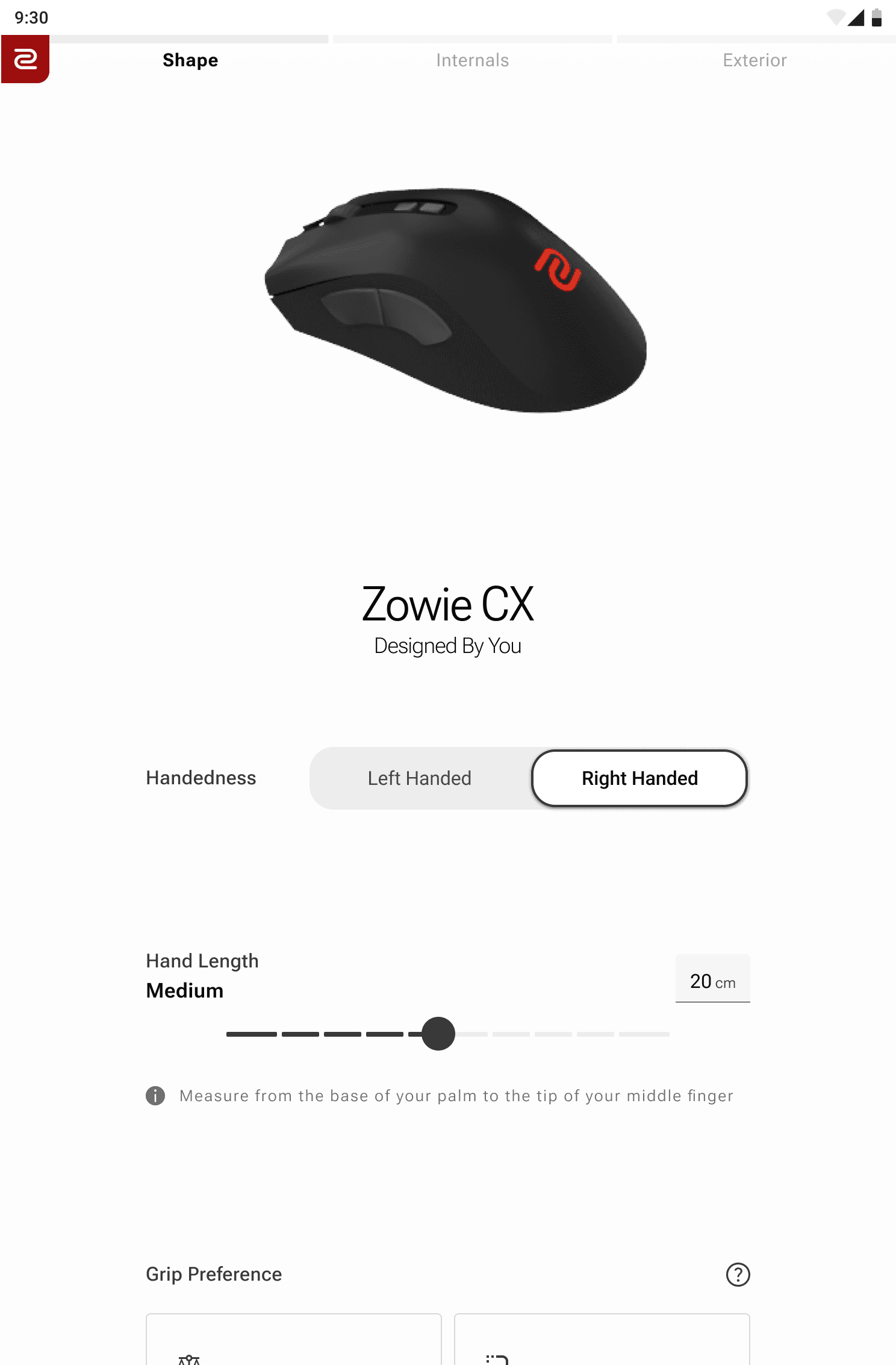
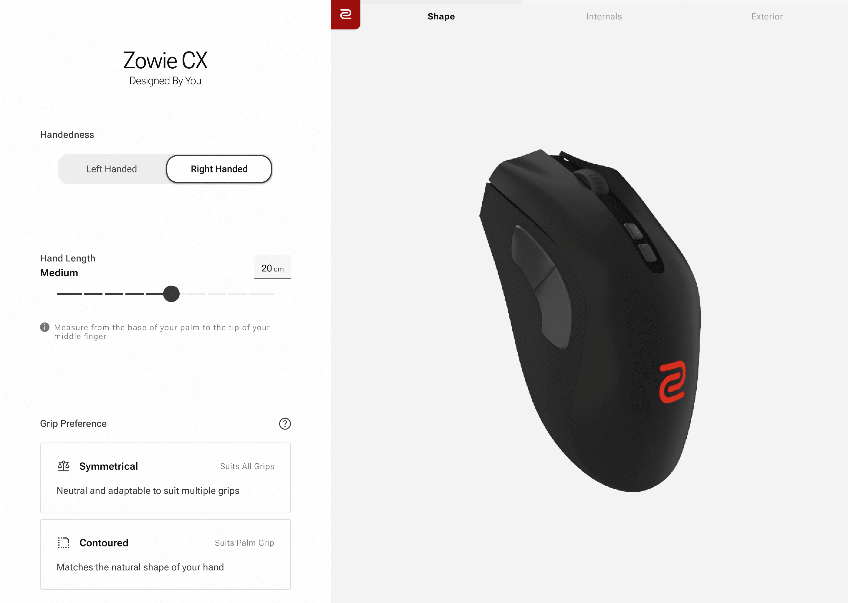
User Process
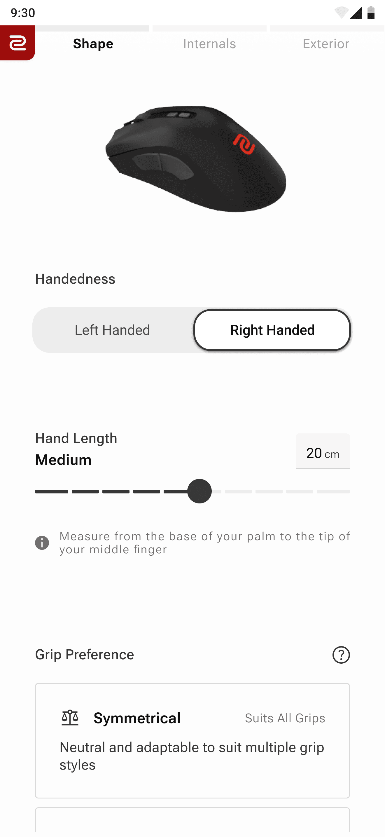
The configurator has three key categories—Ergonomics, Internals, and Exterior—each grouped by the type of customisation being made. This structure helps users understand where they are in the process and what kind of changes they’re making. It also highlights where tooltips and overlays are used contextually to guide decisions, providing support without interrupting flow.
Interactive Elements


Integrating the 3D Model
Using a free domain model as the base, the mesh and shaders are customised to replicate the look of a real life product.
Traditional three-point photography lighting techniques are used within blender to further enhance the realism of the model.
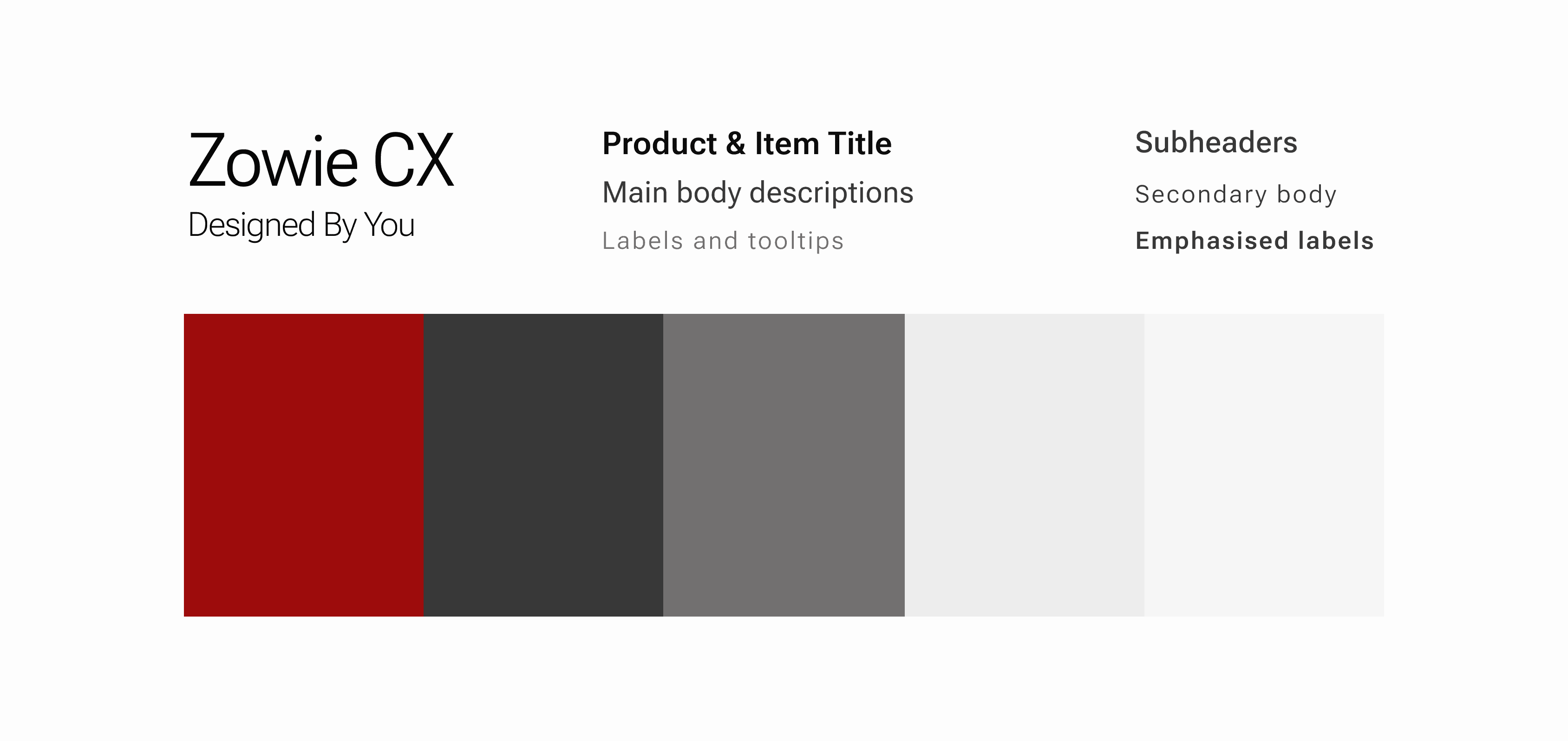
Typography & Palette
Web ready font Roboto Flex for granular control over weight and width. Monochrome palette with the brand colour for accenting emphasises the minimal, sophisticated design. Use of greys in font colours to further support visual hierarchy across the UI.

Behind the design iterations
A very early prototype
Aside spacing and typography issues - nav bar below model is too abstract, components are too dense and images within them are too small to bring value to decisions.
Striping back design elements.
Developing final design direction
Navigation and progress is much clearer. Scrollable UI is intuitive, spacing give breathing room for each decision. Tooltip next to sub header gives more context to its function.
Lighting & Visual Clarity
Creating realistic shading in Blender required careful lighting control—not just for visual fidelity, but to maintain focus on the UI. The challenge was building atmosphere without overwhelming the minimal interface, ensuring both aesthetics and usability stayed in balance.
Interaction Driven 3D Feedback
Connecting user input to the 3D model introduced unexpected complexity. After testing various solutions, I landed on a modular video-based system to simulate configurator responses—balancing visual polish with usability and performance.
Simplification Through Curation
In early tests, presenting users with too many options led to an overwhelming interface. I refined the experience by limiting selections to curated components based on attributes (light click, heavy click etc), leading to a more streamlined, frictionless flow.