A self-initiated custom keycaps project aimed at combining tactile responsiveness, typing comfort and productivity centric macro icons into an all encompassing product. This project explored ways to translate tactile expectations and aesthetic design into a final manufactured product, while overcoming issues around configurability and the limitations of small batch production.


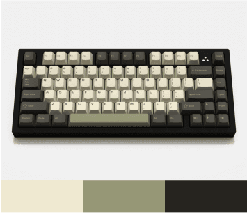
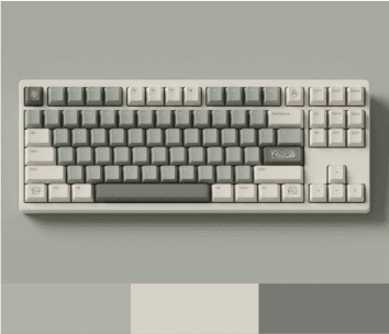
Researching Palettes
Palette choices are typically defined by the colour hierarchy naturally created through the distribution of colours across the alpha, modifier and function keys.
The most effective palettes implement an analogous scheme with varying tints and shades to create a balance of distinction and harmony between the modifier and function keys.
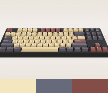

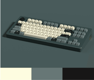


Creating the palette
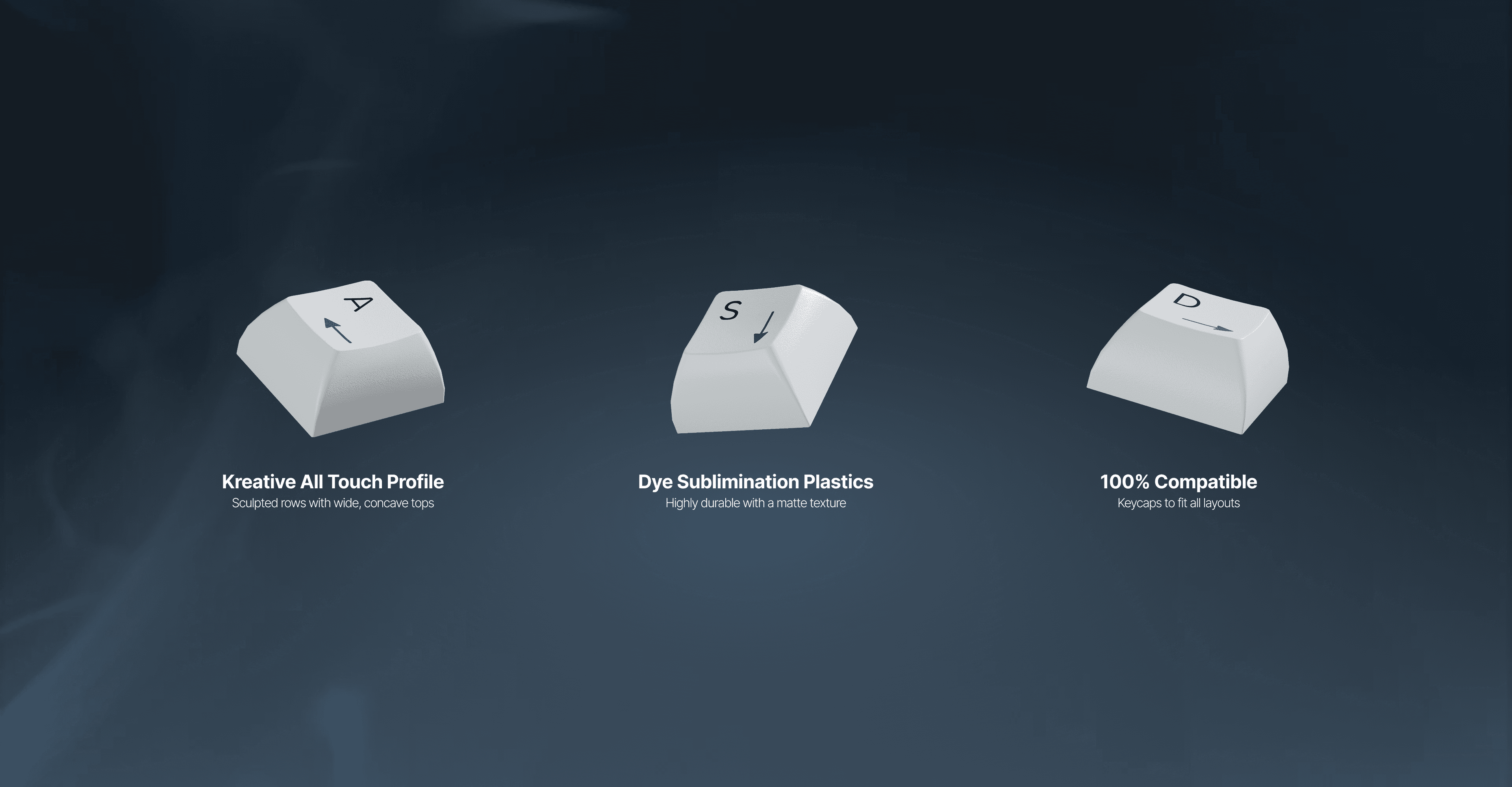
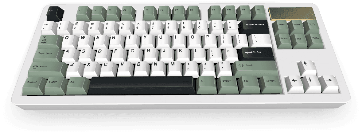
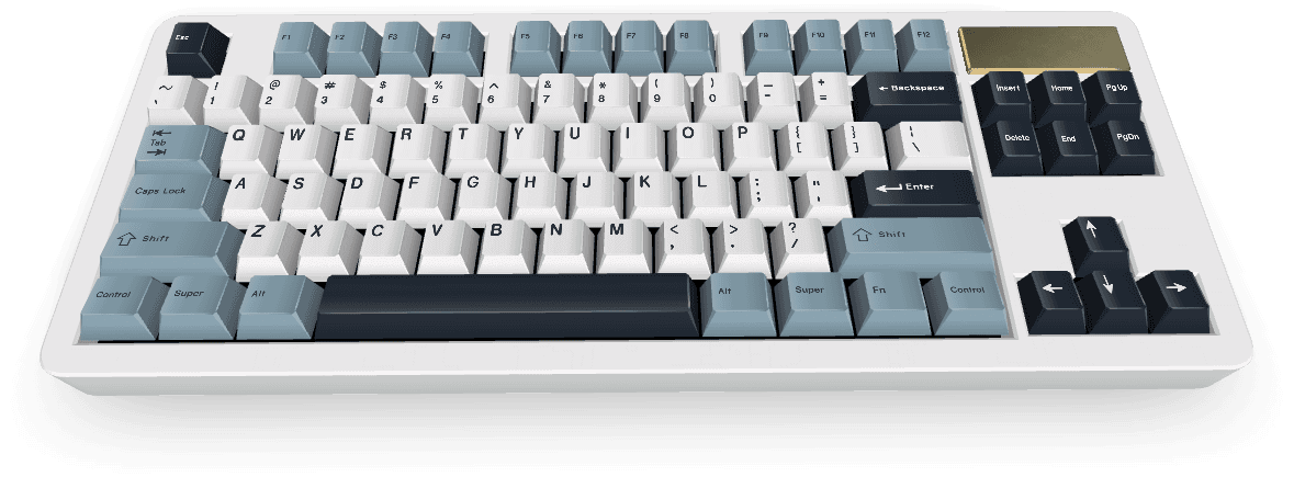
Type Selection
Trialling of multiple font options and placements. Sans serif is generally preferred for its legibility at small sizes, with a notable exception being Apple Mac keyboards from the 90s.
Inter was selected for its modern design attributes while still retaining a classic feel popularised by Open Cherry.
The chosen type also maintains readability when positioned in the Cherry layout - allowing for supplementary icons on alpha keys.


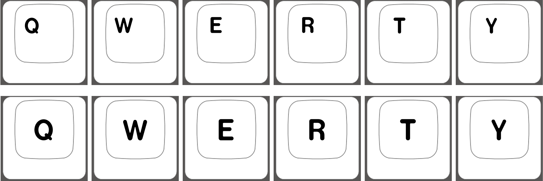
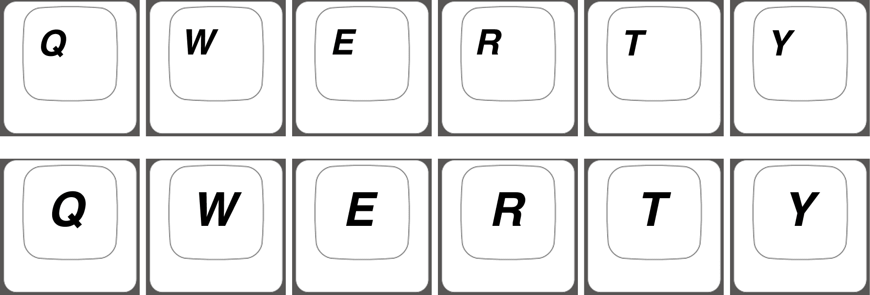
Cherry Layout: Top Left
SA Layout: Centred
Iconography: Google Material Icons
Using an Open Source icon library allows for a large pool of cohesive icons to choose from that are already familiar to most people and can be applied to numerous functions depending on a users needs. Focusing on the inclusion of audio, window and app icons gives users a wide range of potential macro combinations to apply to their own unique workflow.


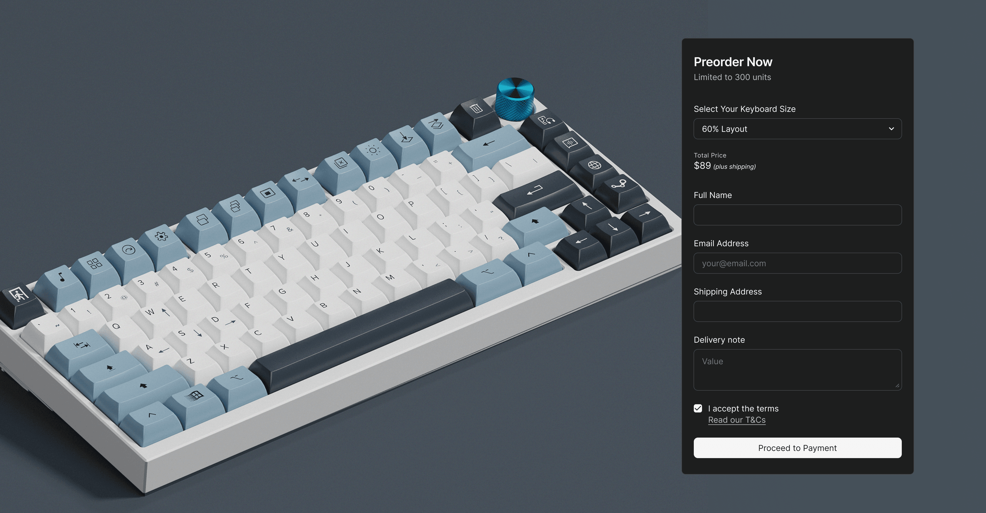
Product Page Engagement
Creating an engaging and informative product page required multiple design skills, requiring me to learn a new workflow and gave some insight into the process tech businesses go through when creating their own pages.
Screen to print translation
Due to the dye-sublimination printing method, colours were less vibrant than expected when the keycap samples were produced. Additionally, finding the right balance of size and legibility when printing text at small sizes was a new challenge to me.
Production Expectations
Some minor printing alignment issues are apparent on the final product I received. Because this is a personal item, I was not too bothered, however it does reinforce the importance of vetting multiple prototypes before a actual product run.